

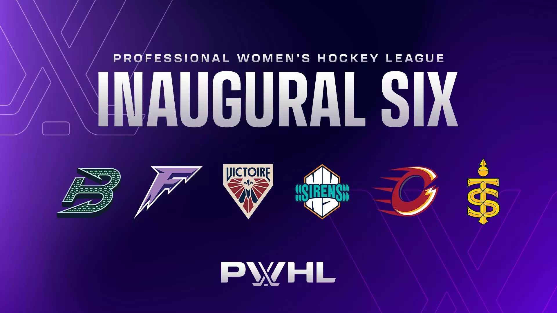
Ranking the new PWHL team names, logos
The highly anticipated second season of the PWHL is right around the corner. The teams are preparing to take on the season with brand-new names and logos. After playing the past season without traditional team nicknames, here are the highly anticipated rankings for the six PWHL teams.
6. Ottawa Charge
The main reason I have them ranked last is because their logo looks too much like the Calgary Flames logo. It’s not super creative and the “C” they used for the logo is in a strange font. The “C” looks like an “O” in my opinion. Overall it seemed like somewhat of a rush job and came off as underwhelming.
5. Boston Fleet
I like the reasoning behind the team name here and how important Boston’s harbor has been in American history. Any other reference wouldn’t have been as impactful as this reference to the American Revolution. With that said, the reason why I have it so low on the list is because the logo is a little underwhelming.
I’ve never been a huge fan of logos that are purely letters as they come off as uncreative. While the “B” in their name forms an anchor, I would have liked to see them include a ship of some sort.
4. Minnesota Frost
The perfect name for a team in a location known for its blistering chill, the Frost perfectly encapsulates not only the cold of Minnesota but also the ice of the rink. While I think this could have been a good opportunity for a mascot like a Yeti or something like that, this name was still a good pick.
Much like the Fleet’s logo though, it’s a letter logo, which ultimately dropped it a few positions.
3. New York Sirens
The logo? Amazing. The name? Leaves more to be desired. This team would easily be top two, but the name isn’t all that inspiring. Naming a team after the goal siren really lacks the impact and creativity that other team names on here have.
While the goal siren is absolutely one of the most well-known traditions in the sport, I don’t really think a team should be named after that, especially in a city with as rich of a history as New York City.
2. Toronto Sceptres
At first, I wasn’t a huge fan of the name, but after reading the team website, it gives a whole new look to the name. The Sceptre, which is an ornamented staff carried by rulers during ceremonial occasions, is a symbol of royalty and power.
It fits in even better when you remember that Toronto is nicknamed the Queen City.
1. Montreal Victoire
This logo is easily the most creative out of all of them. You can tell that the team put a lot of time into designing this and it paid off. The team name is also pretty good. “Victoire” means victory or conquer in French.
It’s the perfect name for a sports team and is empowering to both the fan base and the team itself.
While the highly anticipated second season of the PWHL is still months away, there’s still plenty to be excited about with these brand-new team names and logos.
Ethan Ellis is a fourth-year majoring in broadcast journalism. To contact him, please email ece5133@psu.edu.
Credits
- Author
- Ethan Ellis
- Photo
- PWHL