

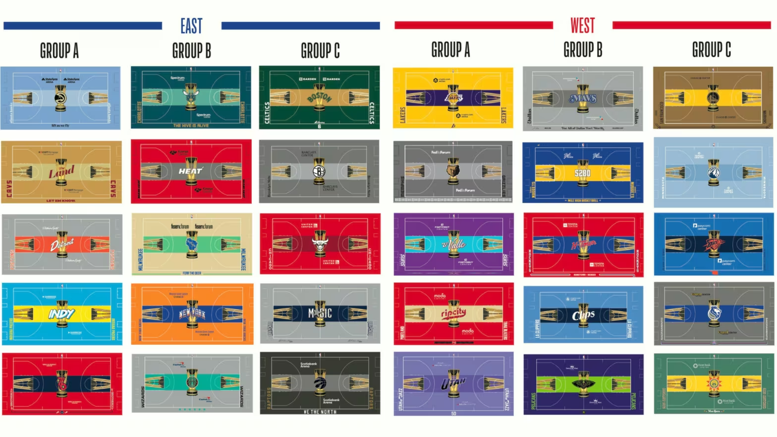
NBA In-Season Tournament Courts
Go Big or Go Home. A phrase that originated as a sales slogan from a motorcycle parts company in the 1990s before it became a cliche sports idiom used by millions.
More recently, the NBA’s marketing team apparently embodied this phrase when designing the hardwood for the 30 franchises in the association for the debut of the in-season tournament.
On Monday morning, the NBA released the bold court designs that will be used for group play and the knockout rounds of the in-season tournament. The courts are based on each team’s City Edition uniforms and their color scheme.
With that being said, let’s rank the ten worst followed by the ten best court designs.
30. Indiana Pacers
The font looks like a permanent marker. The yellow stripe is rather hideous. It’s just quite the eyesore.

29. San Antonio Spurs
The court gives off way too much SuperSonics vibes. I am still not a huge fan of the yellow stripe. Why did they go with these colors for the Spurs?

28. Memphis Grizzlies
The gold does not make much sense for the Grizzlies. There was much more creative potential with the Memphis Grizzlies’ blue.

27. Brooklyn Nets
Similar to Memphis, there is not much creativity going on here. It needs more flare. Even the font on the baseline is incredibly basic.

26. New Orleans Pelicans
New Orleans is known for its unique culture, so it makes sense why a risk would be taken here with these colors. However, the purple and green make little sense and may cause headaches.

25. Golden State Warriors
This shade of brown should not be mixed with a yellow stripe.

24. Dallas Mavericks
The all gray court. What a terrible decision. They lose even more points for plugging their two websites on the sidelines. Where is the blue at?

23. Washington Wizards
There are probably 4-5 other teams that this court could fit better. Points for the throwback logo, though.

22. Sacramento Kings
The throwback logo is nice, but the rest is a big miss. Choosing gray as the primary color is a mistake.

21. Miami Heat
It feels like there was a lot more potential for this design. It is just too bland for a team like the Heat. Add something on the sidelines or switch up the Heat logo at midcourt.

The Top 10
10. Charlotte Hornets
The contrasting blues are beautiful. The phrase at the bottom is great as well.

9. Philadelphia 76ers
The red-on-blue is impeccable. The font on the baseline is also great. Half-court logo could use some work, but it is still clean nonetheless.

8. New York Knicks
The orange may be a little too much in person, but the classic Knicks colors lock this court into the top ten.

7. Oklahoma City Thunder
Big fan of the orange logo. It makes the blues mesh very well together. Well-done.

6. Portland Trail Blazers
Very creative design with eye-catching colors. I absolutely love this design.

5. Chicago Bulls
I was not that high on this prior to seeing what this looks like in the United Center. After seeing this tweet, it’s hard to exclude this from the top five. https://x.com/chicagobulls/status/1719020935762588011?s=46&t=ja6BfwADZojrokjJ8dlGWw

4. Phoenix Suns
Vibrant, creative, original and represents the community. Job well-done here.

3. Boston Celtics
The dark-green just does the job here. Classic look while honoring Bill Russell at the bottom.

2. Utah Jazz
The purple should show out in-person. The “Utah” logo sticks out. No complaints here.

1. Minnesota Timberwolves
The Timberwolves City Edition uniforms were a consensus favorite amongst the NBA fanbase, and they nailed it again with this elegant court. What beautiful blues.

Credits
- Author
- Rocco Pellegrino
- Photo
- NBA.com