Best retro NHL jerseys
One of the coolest aspects of NHL hockey is their jerseys. As cool as the current jerseys are, there is nothing like those old threads worn in in the early 2000’s and before.
I am going over some of my favorite classic jerseys. There won’t be any relocated teams like the Nordiques, only classic jerseys from current NHL teams.
Sabres “Goat Head”: 1996-2006

SI/Timothy T. Ludwig
This is one of the best looking jerseys of all time. Arguably is THE best jersey of all time. The colorway with the logo looks amazing, and it being worn by one of the best goalies in history, Dominik Hasek, just adds to its legacy.
The logo of the charging buffalo with the red eyes just looks angry but still has a vintage feel to it, and red and black is the best color combination to exist.
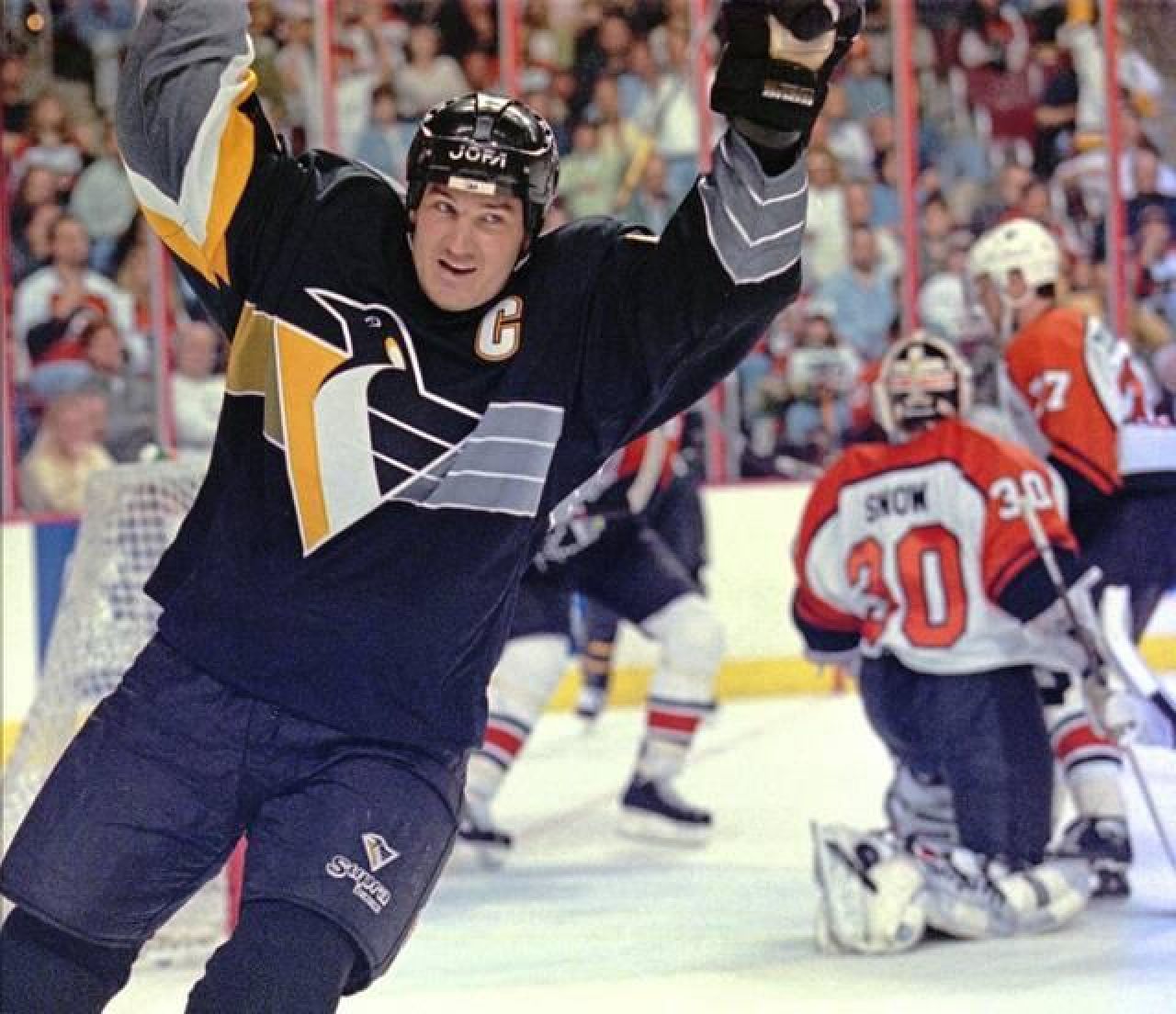
Pittsburgh Penguins “Robo Penguin”: 1992-2002

Associated Press
This is another jersey that is made by its iconic colorway and the legends that wore this jersey. You had Jaromír Jágr and Mario Lemieux sporting this jersey for most of their prime.
The black and yellow is iconic to the city of Pittsburgh, but the change in logo is what makes the jersey stand out so much.
Depending on who you ask, you will get different answers on if its a good logo, but it’s a nice change from the classic skating penguin and that’s what makes it a good logo.
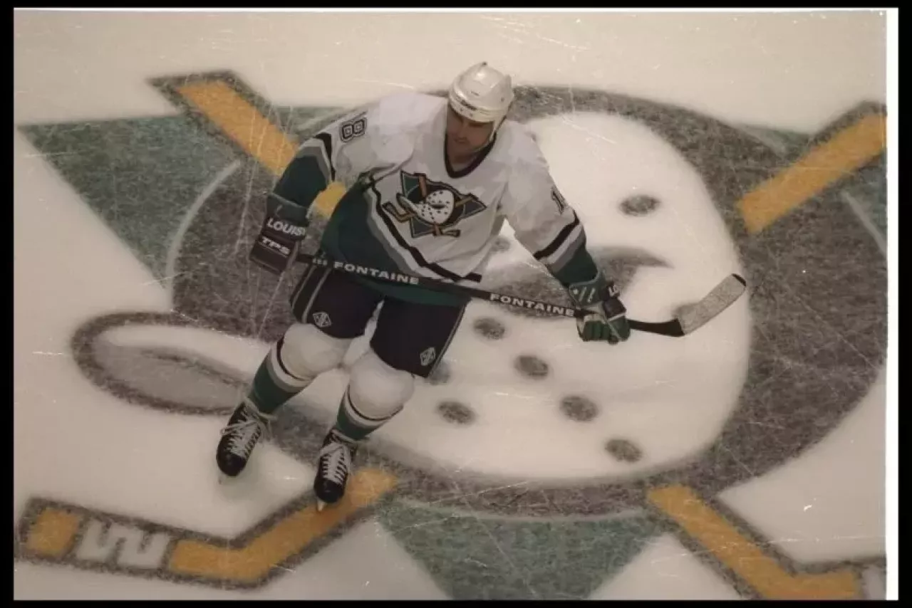
Anaheim Ducks Original Mighty Ducks: 1993-2006

Glenn Cratty/Allsport
These jerseys are so cool because of the logo. The duck shaped goalie mask with the hockey sticks behind them is an amazing logo. Not to mention the nod to the Mighty Ducks movies.
The purple and teal is an odd color combination but works so well. This might be one of the most hated changes in logos in history from this to the duck foot.
They did a decent job with the resurgence of the logo, but the bright orange just doesn’t do it as well now as the purple and teal did in the 90’s.
Arizona Coyotes “Kachina”: 1996-2003

Matt Kartozian-USA TODAY Sports
This logo alone might be one of the best logos in NHL history. The abstract art of the coyote is something that just stood out. The moon shoulder patch is a nice touch too.
The design took a lot of colors that shouldn’t work and having five different colors all together and wrapped them perfectly into a jersey around the logo.
The collar and sleeve/bottom of the jersey design just give an old western vibe that matches perfectly with the desert that represents Arizona.
Utah has a really cool color scheme, but the loss of this iconic logo is a little painful.
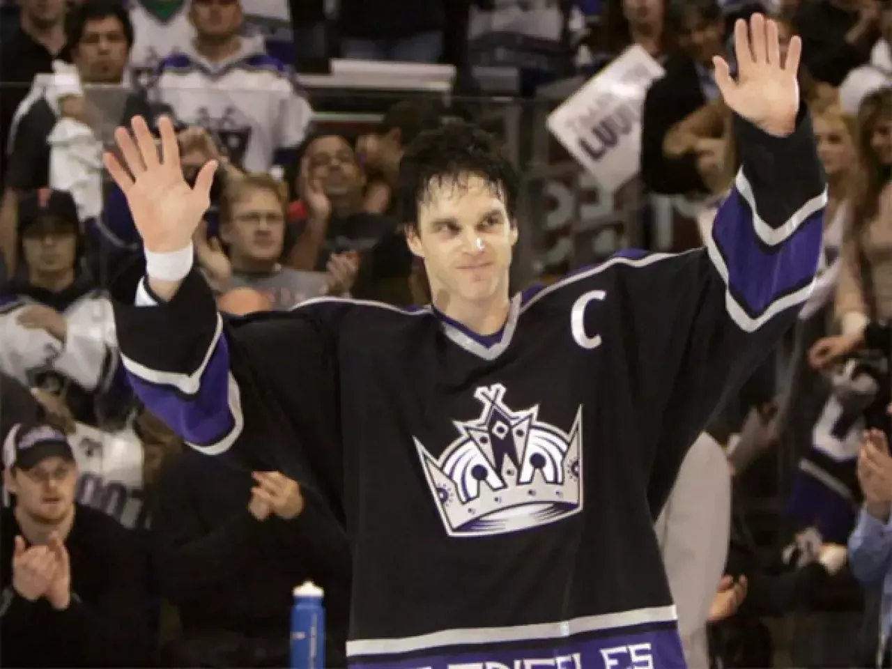
L.A. Kings Crown: 2002-2011

Allen J. Schaben / Los Angeles Times
The simplicity of this jersey just makes it so clean. The purple is iconic to the Kings, with them being one of the only teams to ever wear it, and the logos on the jersey look so good.
The crown is obviously perfect for the Kings, but the sticks at the top of the crown and the suns on either side of the crown are perfect to represent L.A. hockey. The shoulder patch is another perfect touch with a shield with two lions facing each other separated by hockey sticks.
It’s one of those jersey concepts that the home, away and alternate all work well and look good in all the combinations.
The reverse retro runs have made a nice effort at a resurgence of the classics, but it’s hard to live up to the vintage classics.
Tristan Kunec is a fourth-year majoring in broadcast journalism. To contact him, please email tqk5432@psu.edu.
Credits
- Author
- Tristan Kunec
- Photo
- Bob Frid-USA TODAY Sports